![By Schleger, Hans (artist), W R Royle and Son Ltd, London EC4 (printer), Her Majesty's Stationery Office (publisher/sponsor) [Public domain], via Wikimedia Commons](https://susannahstraughan.com/wp-content/uploads/2017/11/Address_your_Letters_Plainly_Art.IWMPST3449.jpg)
Hans Schleger poster for Her Majesty’s Stationery Office
If you’ve never visited the Jewish Museum in Camden Town, London, you’re missing out on one of the capital’s best small museums. Following the 2014 exhibition on Abram Games, Designs on Britain celebrates the work of several more Jewish émigré designers during the 20th century, with an array of posters, books, fabrics and even a Raleigh Chopper bike.
![By Dekk, Dorrit (artist), Fosh and Cross Ltd, London (printer), Ministry of Works Mobile Labour Force (publisher/sponsor), Her Majesty's Stationery Office (publisher/sponsor), Ministry of Labour and National Service (publisher/sponsor) [Public domain], via Wikimedia Commons}]](https://susannahstraughan.com/wp-content/uploads/2017/11/Join_the_Mobile_Labour_Force_Art.IWMPST13971.jpg)
Dorrit Dekk poster for the Ministry of Works Mobile Labour Force
As a member of the Twentieth Century Society I was already familiar with Hans Unger, who produced beautiful mosaics and stained glass in the 1960s and 70s, and Misha Black, who masterminded the redesign of the Victoria Line. But one of the pleasures of Designs on Britain was discovering the charming illustrations and posters of Dorrit Dek (1917–2014), including some elegantly dressed ladies on a Tatler front cover from 1956.
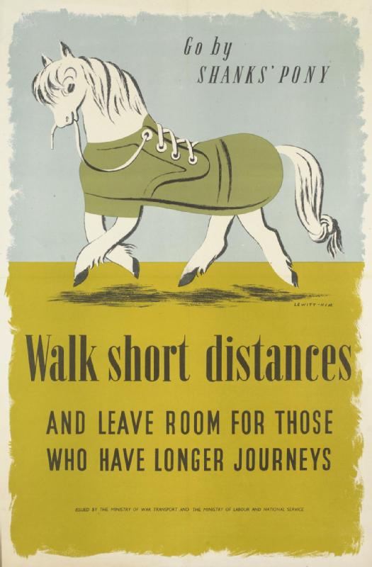
George Him and Jan Le Witt, poster for Ministry of War Transport
Transport – especially in London – is a major theme of Designs on Britain. Misha Black commissioned the Czech-born Jacqueline Groag (1903–86) to produce seat cover fabric for the District Line (in typically 1970s shades of brown, yellow and orange) and her intricate, sometimes folk-art style patterns were used on everything from carpets and wallpaper to greetings cards.
You can also see Hans Schleger’s redesign of the London Transport bus stop ‘flag’ from 1935. I was less excited about Schleger’s disturbing contribution to Shell’s ‘These Men Use Shell’ poster series, in which the blank-eyed head of a (male) journalist bursts through a sheet of newsprint, along with a giant pencil.
Inevitably, covers for Penguin Books feature prominently in this exhibition, including Romek Marber’s highly influential grid for the Penguin Crime series from the early 1960s. He tweaked the shade of ‘crime green’ and standardised where the logo, price and book title were positioned, making life easier for cover designers and readers.
In the section on corporate branding I admired the stencilled perfection of F.K.H. Henrion’s Tate & Lyle logo from 1965, in which 12 sugar cubes are integrated within the letters. His work also included logos for the National Theatre, the LEB (London Electricity Board) and fashion retailer C&A.
Designer Tom Karen (born 1926) may favour more sedate forms of transport these days, but his Raleigh Chopper bike was as much a part of a 70s childhood as wrapping your jaws around a Curly Wurly while watching Noel Edmonds on Multi-Coloured Swap Shop.
Whatever form of transport you favour – bike, tube, overground train or Shanks’s pony – don’t miss Designs on Britain, which runs until 15 April 2018.
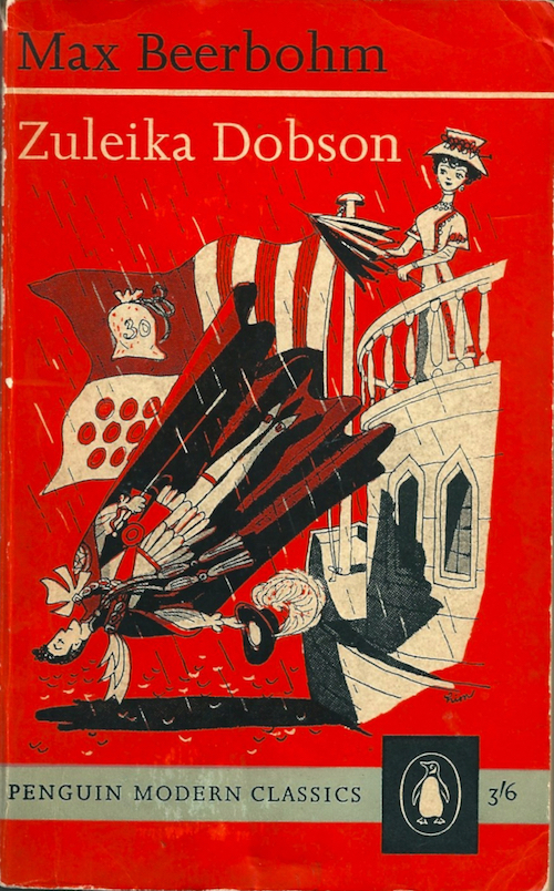
George Him’s cover illustration for Penguin’s Zuleika Dobson