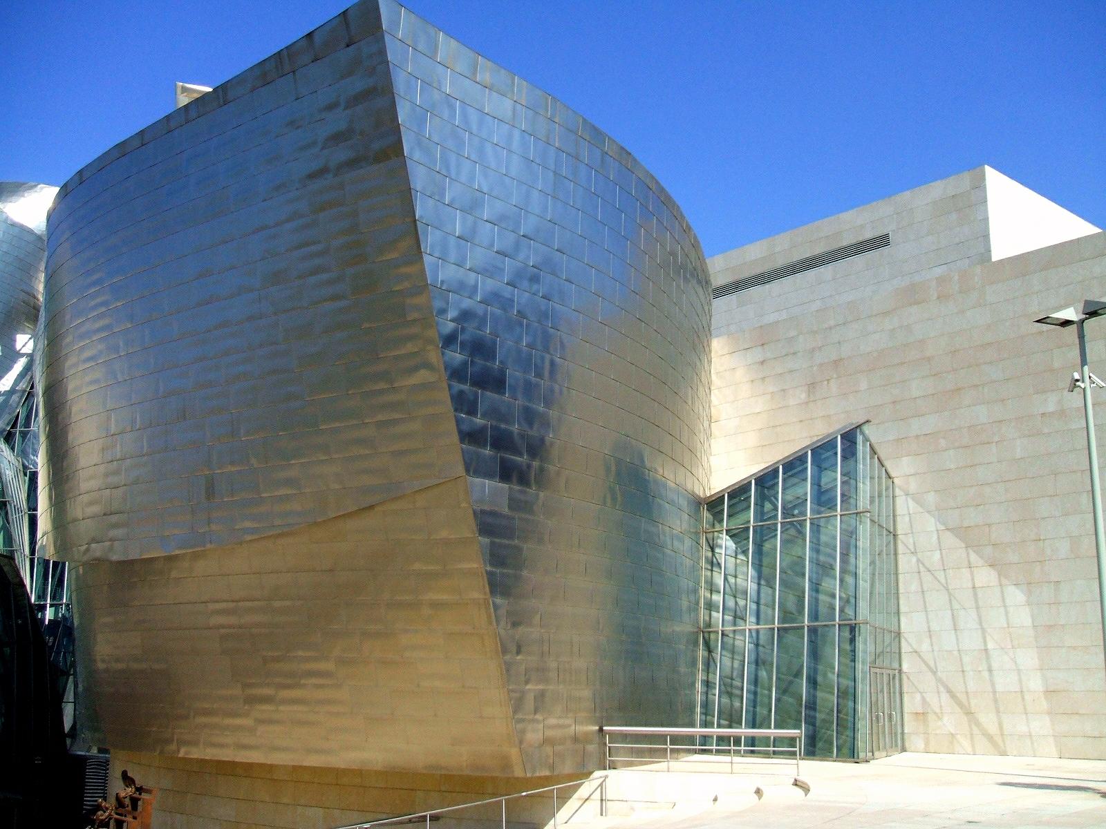
“Are you trying to get me to admit that I’m an egomaniac?” (Frank Gehry, The Secret Life of Buildings)
If only Ali G had been invited to present the final part of C4’s The Secret Life of Buildings: Leisure. No offence to geeky presenter Tom Dyckhoff — a regular on BBC2’s The Culture Show — but the scenes in which he attempted to punctuate the gigantic egos of several leading architects would have been even funnier in the hands of a man with absolutely no boundaries.
Frank Gehry’s Guggenheim Museum in Bilbao has been wowing visitors since it opened in 1997. Dyckhoff, though, was unwilling to be seduced by the weird shapes and shiny surfaces. The theme of this show was “architecture to play in” and his thesis was that the big-name designers are the ones having all the fun at the expense of the end users.
To prove his point he did a quick tour of some of the most iconic buildings of our age, stopping at Rem Koolhaas’s Casa da Música in Porto, the Jewish Museum in Berlin (Daniel Libeskind), and Hadid’s Mobile Art Pavilion in Paris. He also found time to hang out with the tourists at Stonehenge and chat with some of the Westfield Shopping Centre’s most ardent admirers.
The common theme here was that Dyckhoff was both sceptical and underwhelmed by pretty much everything — except Stonehenge. His reaction to the Jewish Museum’s pile of iron faces was a terse “I’m struggling with this unsubtle manipulation of my feelings” and the building’s crossroads layout was dismissed as a “cliche”. In short, this programme was the perfect antidote to the sycophancy and hot air that usually accompanies the annual Stirling Prize.
At the Casa da Música Dyckhoff chatted with Dr Paul Keedwell, a very sensible-sounding psychologist from Cardiff University, who claimed that Koolhaas’s creation was “psychotic”. I felt like cheering when he said: “There’s such a gap between what architects think human beings want and what they actually need.” It’s all very well to create something hugely photogenic that we can admire from across the street, but buildings are not just enormous pieces of sculpture. They need to deliver natural light, flexible space and navigability.
In 2008/09 I worked in the BBC Media Centre in Wood Lane, designed by Allies and Morrison. It was not a happy experience. When you spend a minimum of eight hours a day in front of a computer screen, you want to be able to adjust the level of lighting at your work station and shut out as much noise as possible. Neither of these criteria was fulfilled by a vast open-plan office space, which despite the wall-to-ceiling glazing turned out to be dark, depressing and very noisy. Seated right on the edge of a vast atrium, I could enjoy the arctic blast from inconveniently situated air-conditioning vents as I watched people constantly moving about on every floor.
I like modern buildings and I’ve since seen Allies and Morrison’s much more impressive Blue Fin Building (aka Bankside 1). But removing most of the internal walls and the central core from an office building used by journalists doesn’t make for a pleasant working environment. (We were also denied wastepaper bins, shelves and drawers!) I blame the architects, the designers and above all the cretinous BBC managers who don’t give a toss about the workers. I got out and I’ve never been back there.
Just across the road from the Media Centre is the Westfield Shopping Centre, which provided some of the best moments of Dyckhoff’s architectural odyssey. Describing it (somewhat inaccurately) as “dumbed down Gehry”, Tom met an expert in neuromarketing, who was trying understand how the retail experience is influenced by architecture. Ditching his usual “geek chic” specs, the presenter donned some really outlandish eyewear, which was fitted with a mobile eye tracker.
As he wandered around, Tom’s shifting gaze was constantly monitored on a laptop. It turns out that we’re drawn to light and that the vast areas of glazed ceiling are cunningly designed to produce a dappled effect, which helps to steer shoppers around this agglomeration of shops, restaurants and chill-out spaces. People seemed to be enjoying themselves amongst all the chandeliers, cappuccino machines and shiny baubles, but Tom wasn’t convinced. The neuromarketing man claimed that the deliberately confusing layout ensures the Mall is “delivering its prey to the stores”.
Dyckhoff persisted with his utopian idea of a world in which the general public has a hand in designing public spaces — much like in a giant computer game. It’s hopelessly naive: big cheeses like Hadid, Gehry and Koolhaas didn’t get where they are today by bowing to the whims of the architecturally illiterate masses.
Everything from the layout of the new(ish) Wembley Stadium to the cash-guzzling machine that is Westfield is now predicated on the notion that we want to spend our leisure hours trapped inside a Hollywood movie. Substance is history; surface appearance and instant gratification are everything.


August 16, 2011 at 10:18 pm
Chris (aged 8) took to this programme like a duck to water. I’m now worried that he’ll find the serial repeats of Grand Designs a tad tiresome 🙂
August 16, 2011 at 11:26 pm
Was it the sight of Westfield shopping centre that really excited him or will he soon be planning his first barn conversion?